OUR APPROACH TO STANDING OUT IN A RAPIDLY GROWING INDUSTRY? A STRONG BRAND IDENTITY AND IMMERSIVE WEBSITE EXPERIENCE.

OBJECTIVE
Crook & Marker, an organic spiked seltzer brand, needed an immersive website experience that would engage site visitors.
SOLUTION
We started with strategic thinking and research. The spiked seltzer industry was rapidly gaining attention, and with that came tons of brands releasing their versions of spiked seltzer. That meant we needed to get creative and make something memorable.
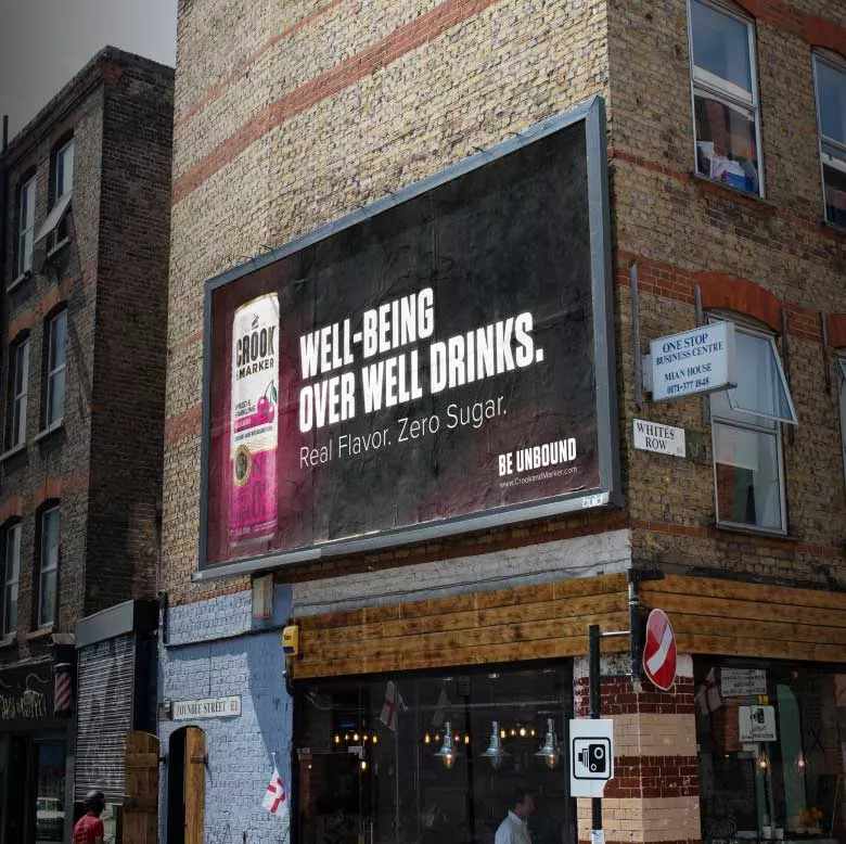
The Crook & Marker brand is all about standing out from the pack, going against the grain, and being unique. The creative reflected this attitude with bright colors, bold typefaces, and unfiltered messaging to match.

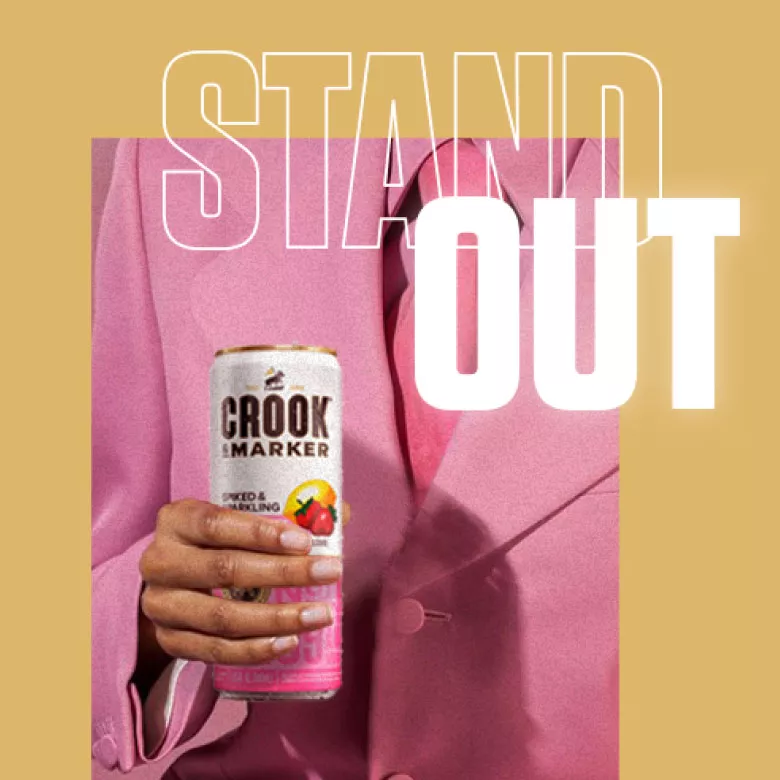
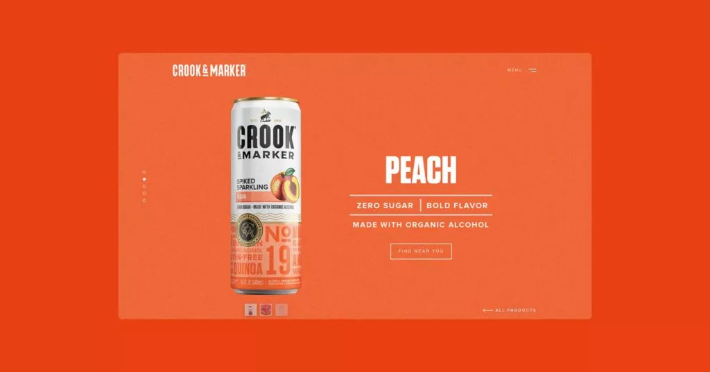
The website we designed was immersive, taking visitors on a sensory experience that would ultimately entice them to purchase.


"Overall, they went further and provided much more than what I expected. [Defy] saw a future for my brand that helped give us new perspective on what we were and who we were able to be. Overall, the organization and creative power is paramount to any other agency I've had the opportunity of working with. To this day I'm able to say we are still close because they treated me like family and it's something I'll never forget.” — Brian Tice, Brand Creative Director
